
Building and scaling an application with the use of a frontend framework has changed the way we approach the separation of concerns. Traditionally HTML, CSS, and JavaScript were all considered separate and maintained from their respective directories.
When building with a framework, such as React, there is a component methodology that already has our elements broken down into rendered logic and UI logic. This is clearly an intentional effort to make our code more modular that we can assemble into various UI elements, components, and pages.
React components and their smaller building blocks, called elements, take care of everything that you would require to build a scalable application, such as event handlers, state changes, and rendering data. They achieve this by blending JS and HTML to create JSX, a syntax extension of JavaScript.
In this guide, we'll go over how we adopted styled-components and transitioned from a Sass/SCSS approach to build this application.

Prerequisites
While you don't have to be familiar with styled-components, you should have an understanding of React and Sass. This particular project used Gatsby and Prismic so feel free to dive into either of those to get started quickly you can check it out here.
A Quick Note on Naming Conventions
Naming conventions are important to keep our style structure organized and modular. Coming from the Block Element Modifier (BEM) convention I would often find myself falling back on this habit. So what convention should we use for styled-component? Well as it turns out BEM might be a little obserlete given the problems that it was originally solving don't really apply to a frontend framework.
1. When styling a new component - we can easily see which modifiers and children already exist. We might even realize we don't need to write any CSS because there is a pre-exisiting modifier.
2. Reading the markup - We quickly get an idea of which elements depond on another.
3. Shared declaritive syntax - Everyone on the team can consistently name components for easier communication between team members.
I haven't come across a naming convention that works particularly well for styled components, but I would encourage everyone to follow the cardinal rule when naming anything. Try and be descriptive as possible and create your components in a way that allows them to be modified.
Setup
Get your project running with your preferend setup. You'll want to install styled-components npm i styled-components or yarn add styled-components. I'm actually going to use emotion, which is heavily inspired by styled components so if you would like to use that yarn add @emotion/react @emotion/styled.
Structure you files in an organized way that makes sense for you.
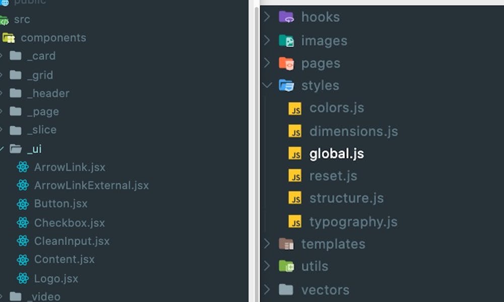
The way we structured this project there are three main places for styles.
1 - /styles - Settings, globals styles, how to layout your structure and other reusable information.
2 - /components - Just like any react application we're going to have all our components here with corresponding sub-directories for UI elements.
3 - Each page, compoennt or template can contain styles that correspond just to that element and don't need to be re used.
Global Styles
We need to pass all our global and layout styles down to the applications ancestors so in order to do this we wrap the root level component with the styles attribute.
We define our global styles
global.js
import css from "@emotion/css";
import colors from 'styles/colors';
import dimensions from 'styles/dimensions';

const globalStyles = css`
  html {
    font-size: 62.5%;
    -webkit-font-smoothing: antialiased;
  }

  html,
  body,
  #root {
    margin: 0;
    -webkit-font-smoothing: antialiased;
    -moz-osx-font-smoothing: grayscale;
    min-height: 100%;
  }

  body {
    width: 100%;
    margin: 0 auto;
    font-size: 1rem;
    line-height: 1.5;
    color: ${colors.grey900};
    -webkit-font-smoothing: antialiased;

    &.is-locked {
      overflow: hidden !important;
    }
Define our structure
Structure.js
import styled from "@emotion/styled";
import dimensions from "styles/dimensions";

const fractionStrToDecimal = str => str.split('/').reduce((p, c) => p / c);

export const Inner = styled("div")`
  position: relative;
  width: 100%;
  margin: 0 auto;
  padding-left: 3.2rem;
  padding-right: 3.2rem;
  max-width: 136rem;

  @media(min-width: ${dimensions.tabletLandscapeUp}px) {
    padding-left: 4rem;
    padding-right: 4rem;
  }

  @media(min-width: ${dimensions.desktopLargeUp}px) {
    max-width: 148rem;
  }
`;
Wrap the root element
Layout.jsx
const Layout = ({children}) => (
  <LayoutContainer>
    <Global styles={[resetStyles, globalStyles, typeStyles]}/>

    <div className="Layout">
      <Header/>

      <main>
        {children}
      </main>

      <Footer/>
    </div>

    <ModalSignup />
  </LayoutContainer>
);
Since I'm using Gatsby.js the root component is the layout file, but if you're using create-react-app or built your's from scratch then in your index.js where you wrap app.js is where you would want to instanciate the global styles.
Reusable UI Elements
Lets look at the button element. first create a button component and import your necessary dependencies, then create a variable for your button.
import React, { Component } from 'react';
import styled from '@emotion/styled';
import colors from 'styles/colors';

const ButtonContainer = styled.button`
  padding: 0.8rem 4.8rem 0.8rem;
  background: ${colors.red500};
  height: 6rem;
  display: inline-block;
  vertical-align: center;
  font-weight: 600;
...
In our render we're going to accept parameters we pass in from where we render our button and then with the help of the spread operator set them as individual attributes.
class Button extends Component { render() { const { children, ...props } = this.props; return ( <ButtonContainer onClick={this.props.onClick} {...props}> <div> {this.props.children} </div> </ButtonContainer> ); } }This is just one example of how you can pass around props to extend the functionality of our UI components, other examples can be found in their docs.
Modifiers
The way we approached this was by passing in the variation you want and then conditionally creating a className.
<ProductSection id='overview'> {product.overview_content && ( <ContentBlock intro={product.logline} heading={product.overview_heading} image={product.overview_image} illustration={product.overview_illustration} content={product.overview_content} variant='large' /> )}Here in the product section, we are passing in the modifier of large. And then in the ContentBlockContainer:
const ContentBlock = ({ intro, heading, content, image, illustration, variant }) => { return ( <ContentBlockContainer className={variant && `ContentBlock--${variant}`}> <Inner> {(intro || heading) && ( <header> {intro && <Rubric>{intro}</Rubric>} {heading && <h2>{heading}</h2>} </header> )}If this variant is present then we can style with that className like so:
@media(min-width: ${dimensions.tabletLandscapeUp}px) { flex: 1 1 50%; padding: 4rem; .ContentBlock--large & { p { font-size: 2.1rem; } } } `;Here we are increasing the size of our paragraph with that className. The sky's the limit for conditional rendering and you can set it up in a way that makes sense to you, but I would encourage you to lay it out in a consistent way so that you can follow the style logically.
Conclusion
As always it doesn't matter what tools we use, but how we use them. Styled components can add some nice extra tricks to your frontend, but don't throw the baby out with the bathwater... Sass being the baby I think. It brought a lot of structure to our projects and for a log time the best option for making our styles modular. Keep it structured and keep it modular and you're good to go.


